
For years I’ve done most of my log scraping and analysis with the usual suspects; bash, sed, awk, perl even. The log scraping still uses those tools, but lately I’ve been toying around with “R” for the analysis.
We’re also going to demonstrate how inadequate it is to characterize system performance (or user experience) using any single number, but especially averages (which we talked about here).
Note that I’m still just getting my feet wet with “R”. It’s a language that is used by many statisticians, but not many “systems” people. That’s a shame. While it has a somewhat steep learning curve for people familiar with other computer languages, it holds a great many benefits which I’ll try to demonstrate in this series of articles.
A Note About the Data
The data is real, but has been obfuscated significantly and names changed of course so nobody will recognize it. These are not the typical Internet searches that typically execute in less than a few seconds. The searches that these customers execute in generating this data can hit thousands of systems, have many hundreds of terms and of course, not be complete until every last system has responded.
I’ve collected search times on 1.85 million hypothetical searches over 2 months with 6 customers (plus all customers) broken out for demonstration. We’re going to suggest that we have an SLO (Service Level Objective) of less than 30 seconds for searches, 90% of the time. The data that records every search looks like this:
$ head -1 search.dat
Date Company totalSearch
$ wc -l search.dat
1847827 search.dat
$ awk '/2018-05/ && !($2 in seen) {print;seen[$2]++}' search.dat
2018-05 -ALL- 2.5452
2018-05 Charlie 9.2316
2018-05 Bravo 19.7676
2018-05 Alpha 20.7264
2018-05 Echo 4.746
2018-05 Delta 246.481
2018-05 Foxtrot 12.6444
The “Average” Information
So, someone is asking why the customer “Alpha” is complaining. The “average” of about 13 seconds seems reasonable and, very close to the “Bravo” customer. While we’re at it, could we look at “Charlie” and “Delta”? Their averages are quite high, but also similar to each other. Charlie just started complaining.
“Echo” has also complained. Their average is quite low, but they claim to have had some outlier queries which bother them. “Foxtrot” is interesting. Their average has come down significantly, but we’re still seeing a high number of queries that are over the SLO of 30 seconds, roughly the same in fact.
So, here’s what we’re given in terms of “averages”. Sure enough, Alpha and Bravo are almost identical, as are Charlie and Delta.
> Means <- function(df) { c(avg = with(df, mean(totalSearch))) }

> ddply(df[df$Date=="2018-05",], ~ Company, .fun=Means)
  Company       avg
1   Alpha 13.144653
2   Bravo 13.153400
3 Charlie 32.956798
4   Delta 32.884540
5    Echo  6.543384
6 Foxtrot 14.259164
If we were to graph this data, it might look like Figure #1.
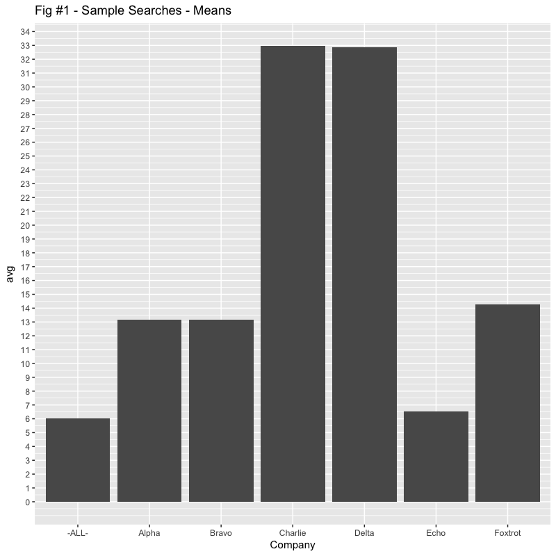
But does that accurately reflect the “user experience“?
The Boxplot
The graph in Figure #1 is probably the last time you’ll see a “linear scale” graph here. In systems work, whether we’re talking about counts or latencies, the 80/20 rule generally applies in spades. The data often spans many orders of magnitude (5 in our case here) and often fits a “lognormal” distribution. The user experience is also fits with lognormal. If your searches are taking 5 seconds, plus or minus a second will be significant. If your searches are taking 5 minutes, plus or minus a second won’t be noticeable.
The following boxplot in Figure #2 uses log scaling for the Search times Y axis. Boxplots are useful in glancing at the distributions. A boxplot consists of a box and “whiskers”. The box goes from the 25th percentile to the 75th percentile (the IQR, or Inter-Quartile Range) with a line indicating the median. The whiskers start at the edge of the box and extend to 1.5x the IQR. If there are outliers beyond the whiskers, they show up as dots. Notches in the boxes are used in identifying overlaps with medians. I’ve also marked the hypothetical “SLO” of 30 seconds with a dashed red line.
Now we begin to see why representing performance with any single number, especially averages, is so inadequate.
The “median” can be used say half the queries execute less than the median, (and of course, half are more, depending on whether you’re a glass half full or glass half empty person). Looking at the boxplot however; typical can really be a range of values (not a single number).
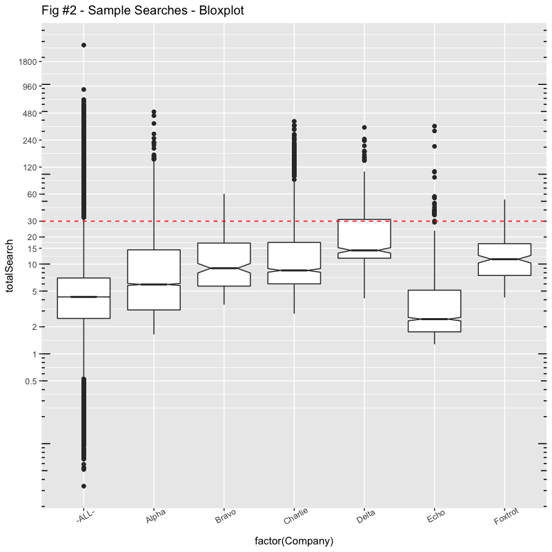
Here are some of the numbers:
> Summary <- function(df) { c(s = with(df, summary(totalSearch))) }
> ddply(df[df$Date=="2018-05",], ~ Company, .fun=Summary)
  Company s.Min. s.1st Qu. s.Median    s.Mean s.3rd Qu.   s.Max.
1   Alpha 1.6416    3.0813   5.9190 13.144653   14.3856 495.6040
2   Bravo 3.5280    5.6784   8.9832 13.153400   17.1048  60.5316
3 Charlie 2.7960    6.0150   8.4876 32.956798   17.3913 388.3380
4   Delta 4.1556   11.6049  14.1840 32.884540   31.3641 332.0540
5    Echo 1.2792    1.7574   2.4336  6.543384    5.1123 343.0280
6 Foxtrot 4.2432    7.4532  11.3130 14.259164   16.8342  52.2684
We can also say that “typical” might be between the 25th percentile and 75th percentile, also 50% of the searches.
So, comparing Alpha and Bravo for example, with almost identical averages, we can see that Alpha has a much greater spread. While their minimum search times are a few seconds shorter, their maximum is over 8 minutes compared with Bravo’s maximum of a minute.
Charlie and Delta also have practically identical averages, but I would suggest that Charlie’s user experience is way better, most of the time.
It is also interesting that, while Bravo and Charlie have wildly different averages (13s vs. 33s), their boxplots, the IQR, is roughly the same (from 6s to 17s). 50% of their “typical” queries cover the same range. Except for some outliers that Charlie has, Bravo’s “user experience” will be very similar to Charlie, much more so than Alpha with the same “average“.
I’ll have more to say about “Echo” and “Foxtrot” later.
Histograms
While boxplots are useful for glancing at the distribution of searches, histograms might allow us to see a bit more, especially since we can sometimes combine data from another dimension.
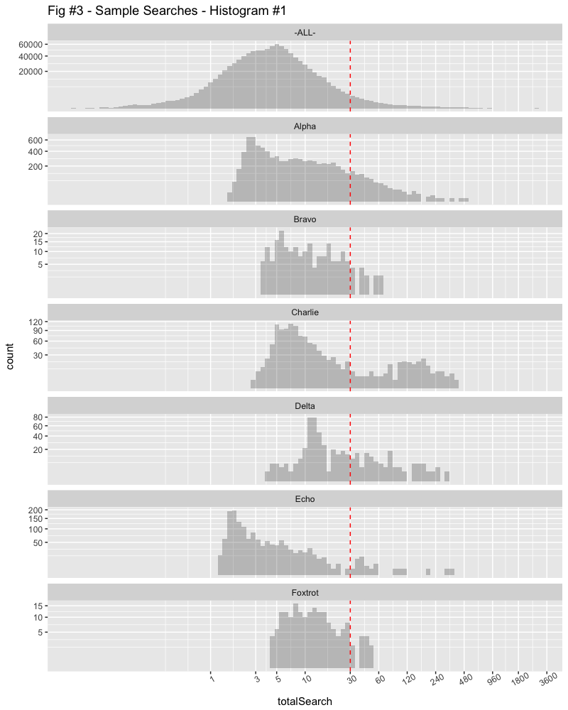
The X Axis is log scale again with the number of seconds, divided into minute sections as the search times get longer. The Y Axis is compressed using a square root scaling to better show the small counts.
Glancing at this confirms that the data for “ALL” customers is follows a “lognormal” scale, almost a bell curve on the log scale. Many of the searches are subsecond while the longest search is over half an hour. (In fact, the range is 34ms, to 45min in our hypothetical data.)
We can easily see that the mode (peak) of most searches for Alpha occurs at less than 3 seconds, but they have a greater range than Bravo, extending out to several minutes.
Charlie’s searches appear to have two modes, one which is 5-6 seconds, another which is over 2 minutes. Delta’s main mode is maybe 10-15 seconds.
Time, Another Dimension
Let’s bring in another dimension to see what’s going on. In this histogram, we’re plotting the previous month’s data in a different colour. The “ALL” customers graph is left out as it’s almost identical and doesn’t contribute anything here.
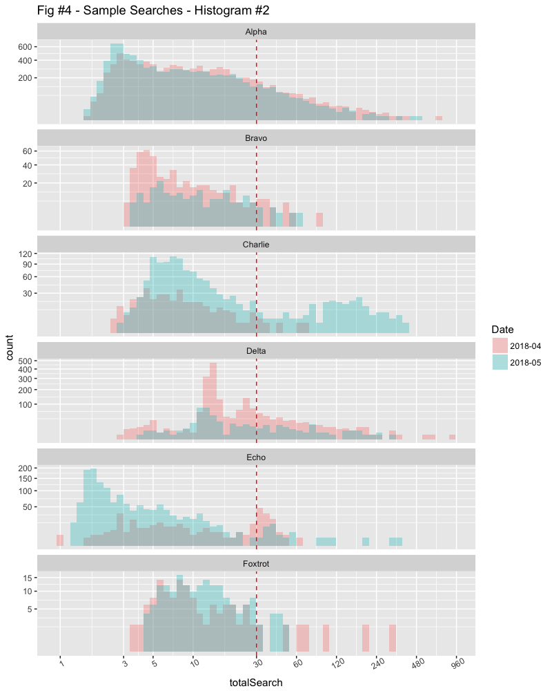
Now we can see why Charlie is complaining. The previous month was much better.
The problem with histograms however, is that if the counts are very different, comparing them can be a challenge.
Kernel Density Graphs
My favourite way to glance at distributions is the Kernel Density graph. The area under the curve will be unity, which means that we can compare distributions regardless of counts. I can, for example, compare yesterday’s data with the entire previous month to see if changes made have likely improved circumstances (or not).
I’ve also added some additional numbers in the graphs to add some context. There’s a wealth of information here if you know what you’re looking for. The legends are divided into 1st-month/2nd-month.
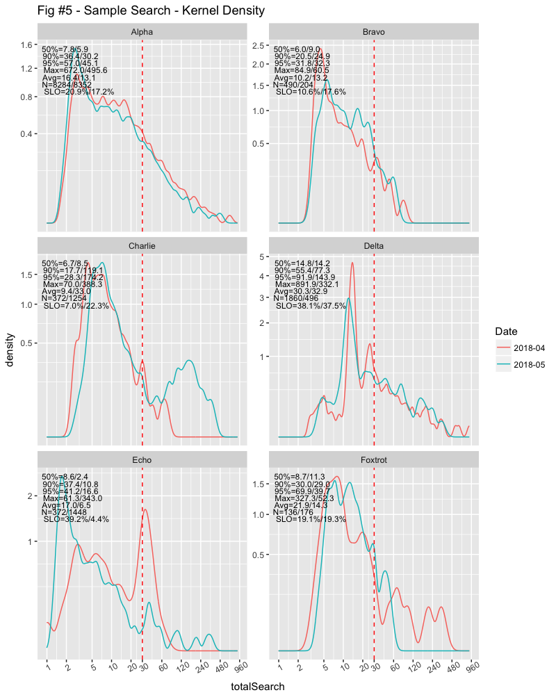
Now we can see that Alpha’s experience is getting better, Bravo’s experience getting worse on less than half the number of queries from the previous month. Bravo also does a fraction of the number of queries that Alpha does.
Charlie increased their number of queries several times from the previous month and, possibly with much more difficult queries. No wonder they’re complaining! The number of queries Delta did dropped by about a third, but the distribution is relatively the same.
The data for Echo was interesting; the mode changed. They did almost four times the number of searches than the previous month, but the main mode dropped from over 30 seconds to less than 2 seconds. But they also had some longer outliers, going from about a minute to over five minutes.
Foxtrot was also interesting. The number of searches over SLO was roughly the same, but their average dropped from about 22s to about 14s, while their median increased from less than 9s to over 11s. You can see that there were far more outliers the previous month, stretching to over five minutes, while the current month is less than a minute. The key with the median increase is the second mode around 14s, while the key to the searches over SLO this month was the peak around 45s.
Summary
I guess the takeaway from this is to be suspicious about any characterizations of performance using a single number like average. It’s doubtful that you can draw any meaningful conclusions with averages or any other single number. To get a deeper understanding about either “normal” or “abnormal” behaviour of systems or what user experiences are, you need a more complete picture, or set of numbers. Both are made easier with “R”.
# Summaries of search times in Seconds..

> options(digits=3)
> Summary <- function(df) { c(s = with(df, summary(totalSearch))) }
> Quant <- function(df) { c(p = with(df, quantile(totalSearch,c(0,0.25,0.5,0.75,0.9,0.95,1)))) }
>
> ddply(df, ~ Company + Date, .fun=Summary)
   Company    Date s.Min. s.1st Qu. s.Median s.Mean s.3rd Qu. s.Max.
1    Alpha 2018-04  1.670      3.82     7.83  16.37     17.27  672.0
2    Alpha 2018-05  1.642      3.08     5.92  13.14     14.39  495.6
3    Bravo 2018-04  3.269      4.42     6.04  10.19     11.36   84.9
4    Bravo 2018-05  3.528      5.68     8.98  13.15     17.10   60.5
5  Charlie 2018-04  2.539      4.50     6.70   9.44     10.69   70.0
6  Charlie 2018-05  2.796      6.01     8.49  32.96     17.39  388.3
7    Delta 2018-04  2.976     13.23    14.83  30.25     26.84  891.9
8    Delta 2018-05  4.156     11.60    14.18  32.88     31.36  332.1
9     Echo 2018-04  0.992      3.94     8.58  16.98     31.53   61.3
10    Echo 2018-05  1.279      1.76     2.43   6.54      5.11  343.0
11 Foxtrot 2018-04  3.542      6.40     8.74  21.87     18.01  327.3
12 Foxtrot 2018-05  4.243      7.45    11.31  14.26     16.83   52.3

> ddply(df, ~ Company + Date, .fun=Quant)
   Company    Date  p.0% p.25% p.50% p.75% p.90% p.95% p.100%
1    Alpha 2018-04 1.670  3.82  7.83 17.27  36.4  57.0  672.0
2    Alpha 2018-05 1.642  3.08  5.92 14.39  30.2  45.1  495.6
3    Bravo 2018-04 3.269  4.42  6.04 11.36  20.5  31.8   84.9
4    Bravo 2018-05 3.528  5.68  8.98 17.10  24.9  32.3   60.5
5  Charlie 2018-04 2.539  4.50  6.70 10.69  17.7  28.3   70.0
6  Charlie 2018-05 2.796  6.01  8.49 17.39 119.1 174.2  388.3
7    Delta 2018-04 2.976 13.23 14.83 26.84  55.4  91.9  891.9
8    Delta 2018-05 4.156 11.60 14.18 31.36  77.3 143.9  332.1
9     Echo 2018-04 0.992  3.94  8.58 31.53  37.4  41.2   61.3
10    Echo 2018-05 1.279  1.76  2.43  5.11  10.8  16.6  343.0
11 Foxtrot 2018-04 3.542  6.40  8.74 18.01  30.0  69.9  327.3
12 Foxtrot 2018-05 4.243  7.45 11.31 16.83  29.0  39.7   52.3
I’ll have a follow up article soon with a more complete explanation of kernel density graphs; their utility and some code. In the meantime, if you’re looking for diagnosing “abnormal” behaviour on systems, take a look at Shades of Grey and EPL Dotplots.