
While working at RIM, I had the privilege of working with some brilliant engineers. During that time I developed a few of the techniques that I’ll be describing; the EPD (Event-Pair-Difference) graph described in my previous post and the EPL (Event-Pair-Latency) Dotplot are a few of them.
Background
The example I’ve chosen to use was a test in the staging environment. We had introduced a small (10ms I think) latency in accessing the main database to see how the system responded. The test had some unexpected results and the main issue that we were trying to solve was why the system developed such long delays and, abruptly recovered.
While the technique I’m about to describe has been used many times since, this test is rich in the different effects that it had on the system. I’ll step through the thought processes while discovering the technique. What we are measuring in this test are messages going through a small section of the back end.
The “Usual” Graphs
The staging automation system was a thing of beauty. For tests like these it would create hundreds, maybe thousands of graphs automatically. Most of them were of the “Event Count vs. Time” type of graph. Two examples are shown in Figure 1 and 2.
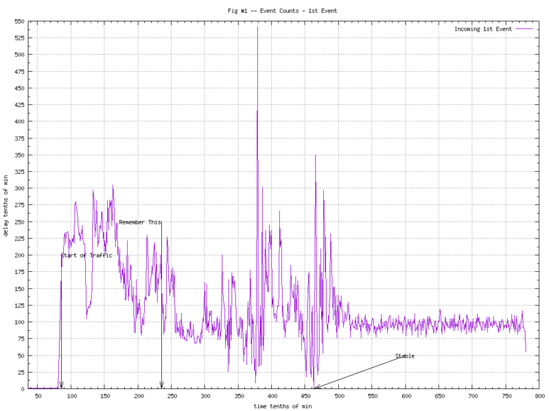
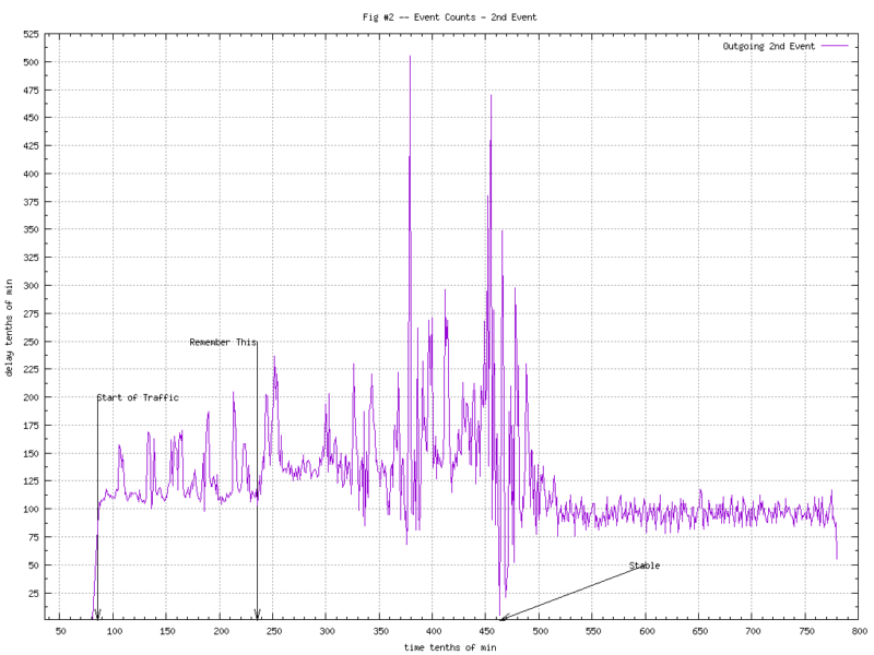
Not a lot can be said about these graphs; pretty noisy. We can tell that something is going on as the second half of the test (after 45min.) the counts stabilize into something “less noisy”.
We didn’t have graphs showing latency between events at the time, but if we had done them, it would’ve looked something like Figure 3. I’m not a big fan of “averages”, but even in this graph you can tell “something bad”[tm] is happening. There’s an interesting spike just before the system stabilizes (and the averages go back to sub-second).
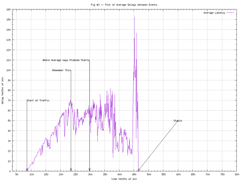
Using the average of the spike to determine where problems start won’t work of course, as pointed out in the graph.
The other thing that the graph of average latency does not tell you is that over a quarter of the messages were not effected at all. You can see this in the histogram during the unstable time in Figure-4.
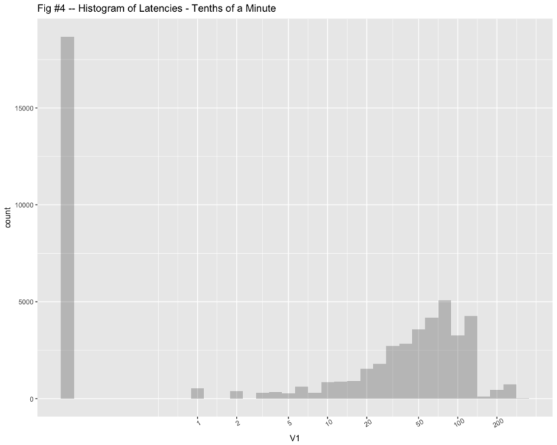
(Note that I added 0.1 to the zeroes so I could use a semilog graph.)
Enter EPD Graphs
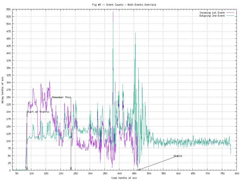
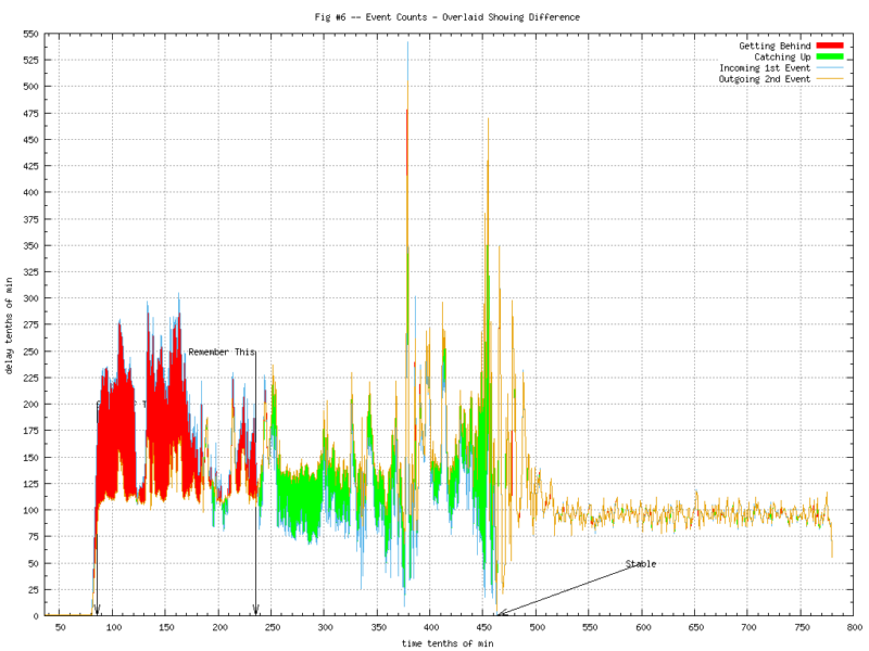
As we did in my previous post, things get more “interesting” when you overlay the counts from two consecutive events. Figure 5 shows the two graphs overlaid. Figure 6 makes the differences more apparent.
Finally, subtracting one count from the other, adding the accumulated difference and we have the noise-free version of the EPD (Event-Pair-Difference) Graph. Now we can begin to see what is going on in Figure 7.
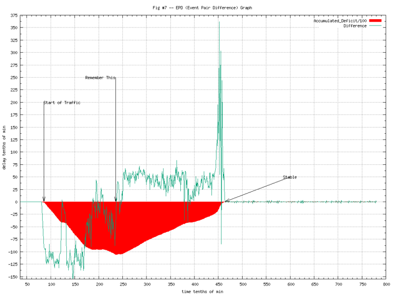
(I’ve scaled the accumulated deficit by a few orders of magnitude so we can show it overlaid with the time-sliced differences.)
The tag “Remember this” is where the peak deficit is and the system starts to recover. There is also the large spike at about 45 minutes into the test where it recovers very quickly. While this graph tells us much more than the information we had before, we still don’t know.. “why?”
The Dotplot
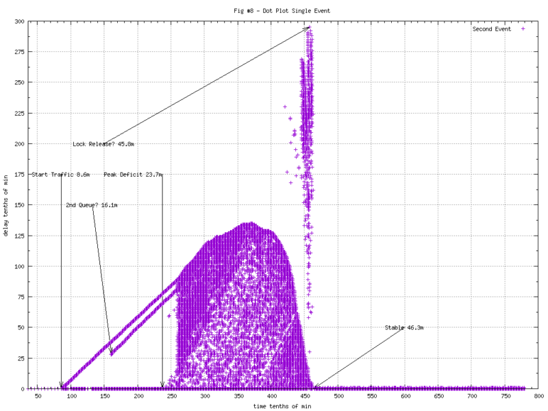
Most dot plots show single events and, this begins to tell us a little more. The dot plot of the second event (where we’d normally measure latency) shows some interesting patterns. The latency is along the Y axis. It appears that some of the messages take an increasing amount of time out of the starting gate. Just prior to becoming stable, we have some long delayed messages crashing through.
Don’t Throw Half Your Data Away!
It gets even more interesting when you add in the other event. Of course we don’t know what the latency will be for the first event until we see the second. Once we have them both, both of them can be plotted the same distance along the Y axis. Now some interesting patterns become readily apparent.
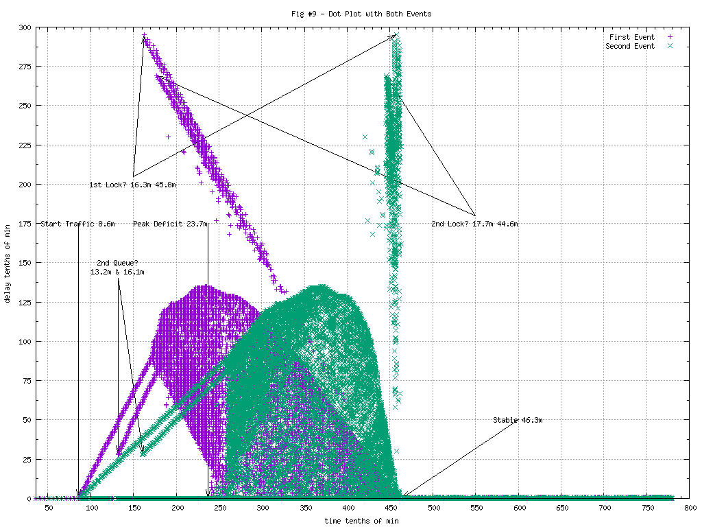
This image is rich with information.
- Some messages get through with zero delay, all the way through.
- Right at the start of traffic, some messages start getting queued.
- At about 13.2 minutes in, a second queue of messages started.
- It appears that messages are initially being dequeued by single threads that can’t keep up.
- 17.5 minutes in, it appears that more threads are added and the completion times become more random.
- 16.3 minutes in, it appears that a lock was aquired, preventing some messages from getting through.
- 17.7 minutes in, it appears that a 2nd lock was aquired, preventing some other messages from getting through.
- The second lock was relinquished earlier however. Roughly 44.6min in as opposed to 45.8min for the first.
Note that messages arriving at the same time, 20 minutes in for example, could be handled several different ways depending on the context of the message. It might go straight through with no delay, might be queued or could be held up on a lock. No other graphs we’d used could differentiate those conditions.
Summary
The data used in these graphs were from messages tracked by unique message IDs. This allowed me to tie the latency back to the first event for plotting, once the second event had been seen. A more common way to do this is by using the latency reported by the second event, often the return of a method call, then plot the first event relative to the second the same distance along the Y axis.
Patterns will often show up as a number of “V”s. The direction they are slanting will generally give a clue of what is taking place. A “V” slanted to the right will generally mean a queue that is growing. A “V” slanted to the left with almost a vertical line on the right will generally mean a lock was being held or single threading through a critical section, and finally released.
The original investigation further subdivided (colored the dots) by other context. For example, showing which messages were sorted to which queue.
EPL Dotplots aren’t always useful. In situations where there are several things happening, it can help sort them out. This test was more “interesting” than most production incidents where there might be only be one or two modes. As an example, I’ve used it in a production environment to prove that there was a lock taking place when engineering swore there wasn’t one. ..And then they found it.
One thought on “Deep Dive, EPL Dotplots”
Comments are closed.