
System failures are often not black and white, but shades of grey (gray?)..
Detecting and alerting on “performance-challenged” system components are a lot more difficult than detecting black or white (catastrophic failures). The metrics used are usually of the “time vs. latency” or “time vs. event count” variety, often aggregated and, often by using averages. All of these tend to obscure what we are looking for and have a very low “signal to noise ratio“.
- Thresholds are difficult to set without getting lots of false positives or negatives;
- Typically used measuring techniques can obscure when problems started (or even that they’re occurring).
Time vs. Latency
This is usually measured by the application and logged. Obviously we are measuring time between two events and we don’t actually find out how long it takes until the second event. Latency can vary greatly, over several orders of magnitude in some cases and still be “normal”.
There are several problems with this “typical” type of data. The first is that the events are often frequent enough that people will aggregate the data into buckets, probably using averages which will smooth over any problems that you are looking for.
If they do notice that the averages are peaking, they’ll often point to the spike and say “the problem started here!“. Nope. It started some time before that and it’s impossible to tell from the “average” how long ago the problem started.
Then there’s the issue of where to set the threshold and whether the threshold is valid across all system components of this type. Generally a very difficult thing to do.
Time vs. Event Counts
The problem with graphing or detecting issues with event counts is that these are generally very noisy, determined by external factors and pretty random. Very good for detecting outages when counts drop to zero, but hard to discover thresholds for components developing sub-standard performance.
Eureka Moment
Over a decade ago I started looking at this in my spare time while working for Blackberry (nee RIM) as a “Systems Engineer”. (Google hadn’t coined the phrase “System Reliability Engineer” yet.) In one of those “Aha moments” I overlayed Time vs. Count graphs for two normally consecutive events. The result was interesting.
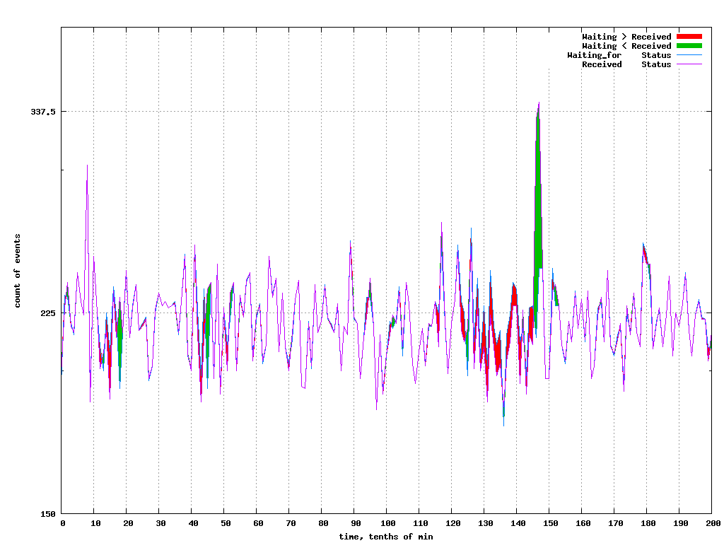
The red part of the graph is when the difference between the second event count and the first event count is negative; more first events than second. Green is the opposite, when the second event is “catching up” to the number of first events.
EPD (Event-Pair-Difference) Graphs
The second part of the “Aha moment” came when I subtracted the one count from the other. This almost totally eliminated the “noise” of normal variations, leaving us with the “signal” we were looking for; when the system components were “performance challenged”. It was like switching on Dolby noise reduction. Effectively, this is when the operation(s) being sandwiched by the two events couldn’t keep up; just what we were looking for.
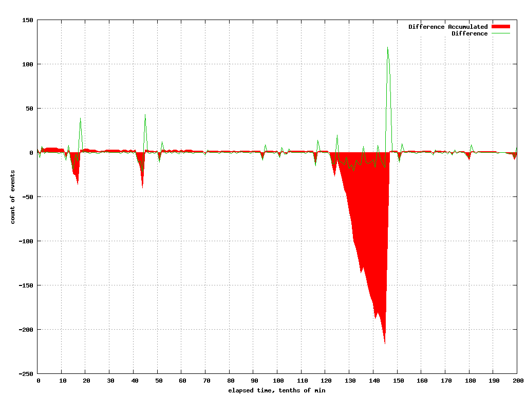
In this graph, I have shown the current differences between the two counts as the green line and, the accumulated “deficit” of work in Red. This shows that the system could not keep up at times and if the conditions persisted, it would have been unstable.
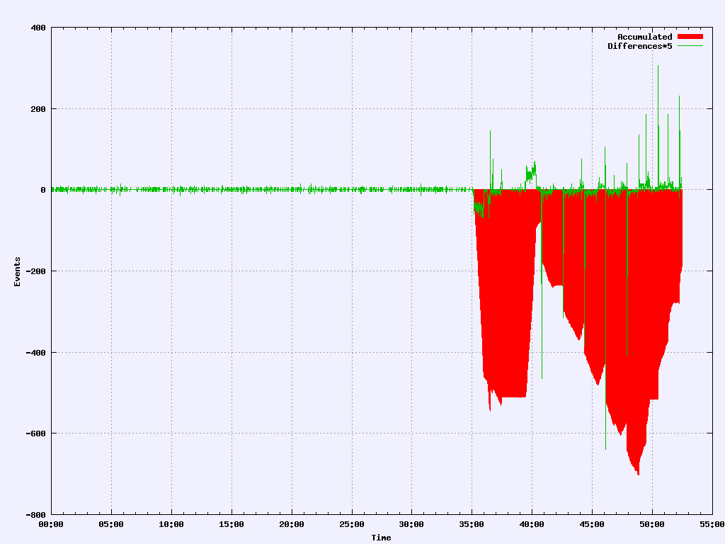
Another example, this time involving some dropped packets and the resulting latencies. Note that “normal” is pretty much zero except for some aliasing errors.
This technique has been used in diagnosing database issues, network issues, application issues with locks, disk subsystem and hypervisor issues among others. I’ve also developed tools that can see these problems developing in real time.
Note that this does not measure latencies directly. It measures when a system component can no longer keep up and, does so immediately.
Method calls and returns are a common case of consecutive events. If the system is stable, the one will equal the other (except for aliasing errors). It doesn’t matter if the same specific instance of the call/return are being counted at the same time. If the operation takes five minutes and the calls are being processed at least as fast as they are coming in, we’ll have a stable system. It becomes unstable (and shows red) when we start getting behind and can’t keep up..
One last thing; the operations might be queued, worked on concurrently in multiple threads, holding on a lock or whatever. This technique won’t really help you diagnose what happened. I have another technique to write about which will help. This will tell you when and where to start looking however, reliably. And it’s so simple.. The subject of my next article, Deep Dive, EPL Dotplots.
References:
A few references on “Gray Failure: the Achilles’ heel of cloud-scale systems”
Gray failure: the Achilles’ heel of cloud-scale systems
https://www.cs.jhu.edu/~huang/paper/grayfailure-hotos17.pdf
Postscript:
- Graphing EPD for stable systems is really boring! No noise!
- Best works at the micro level, sandwiching “interesting” operations; database accesses, network, disk operations;
- Easy to find the worst performers among multiple systems; just a simple sort;
- Works whether normal processing times are 5ms or 5 minutes; it doesn’t matter. If the components are “getting behind”, it will show up like a sore thumb. Immediately.
- This technique won’t catch catastrophic failures where everything goes to zero, but you already have alerts for that, right?
I originally called this “event pair difference” graphs. Thinking that I should name it for what it does rather than how it’s done, I tried “Realtime Component Request Deficit“. That was kind of wordy, so finally decided on “Saturation Factor“. See:
https://billduncan.org/realtime-component-request-deficit/